Streamlining crypto transactions
Anti-Money Laundering Experience
COMPANY
Sygnum
ROLE
User Research, UX Design, Design System
Industry
Digital Assets
YEAR
2024

Context
Empowering clients to invest in the digital asset economy with complete trust, Sygnum seeks to enhance its Anti-Money Laundering (AML) capabilities through a comprehensive redesign with the increased regulation needs.
Challenge
Users struggled with the existing AML process, which involved time-consuming steps and intricate information to process. On average, tasks took 4–5 minutes to complete, contributing to inefficiencies and frustration.
Goal
Improve task clarity and optimise the process for efficiency and usability for clients, while adhering to AML regulatory requirements and standards.
Timeframe
4 months
Target audience
Accredited investors
Background
To guide this redesign, we focused on three key questions:
1. How can we optimise efficiency?
2. How can we better organise content with regulatory requirements?
3. How might we reduce confusion in the existing process?
Process

The design process consists of five key stages: understanding client needs, defining requirements, developing ideas, prototyping the design, and testing it.
This approach enables me to break the project into manageable phases and clearly outline the activities required to address each stage.
Research & Planning
User research
In-depth interviews were conducted with stakeholders, relationship managers, and end users. A constant feedback loop was maintained for communication and testing with users, while insights from the client experience team significantly informed the process.
User personas
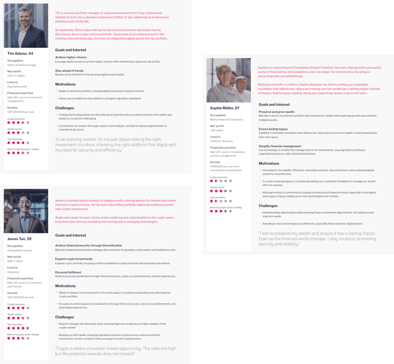
I created personas of users from different parts of the world, with diverse experiences and backgrounds, to help the team step into the shoes of our potential users.
The goal was to encourage our stakeholders to empathise and resonate with our users, where possible, and to keep them in mind when considering business objectives.
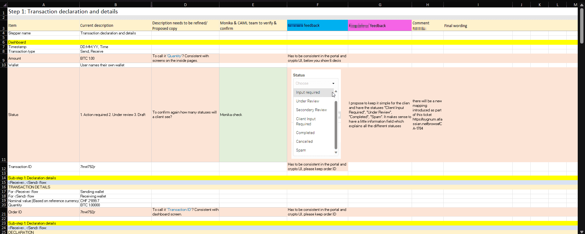
Client journey
In order to improve the workflow, mapping out the client journey helps me to identify opportunities such as improving the visualisation of the required information which is crucial at every step of the transaction verification process.

Insight:
Users face frustration from excessive clicks, unclear question intent, lack of visual cues, and no progress indicators.
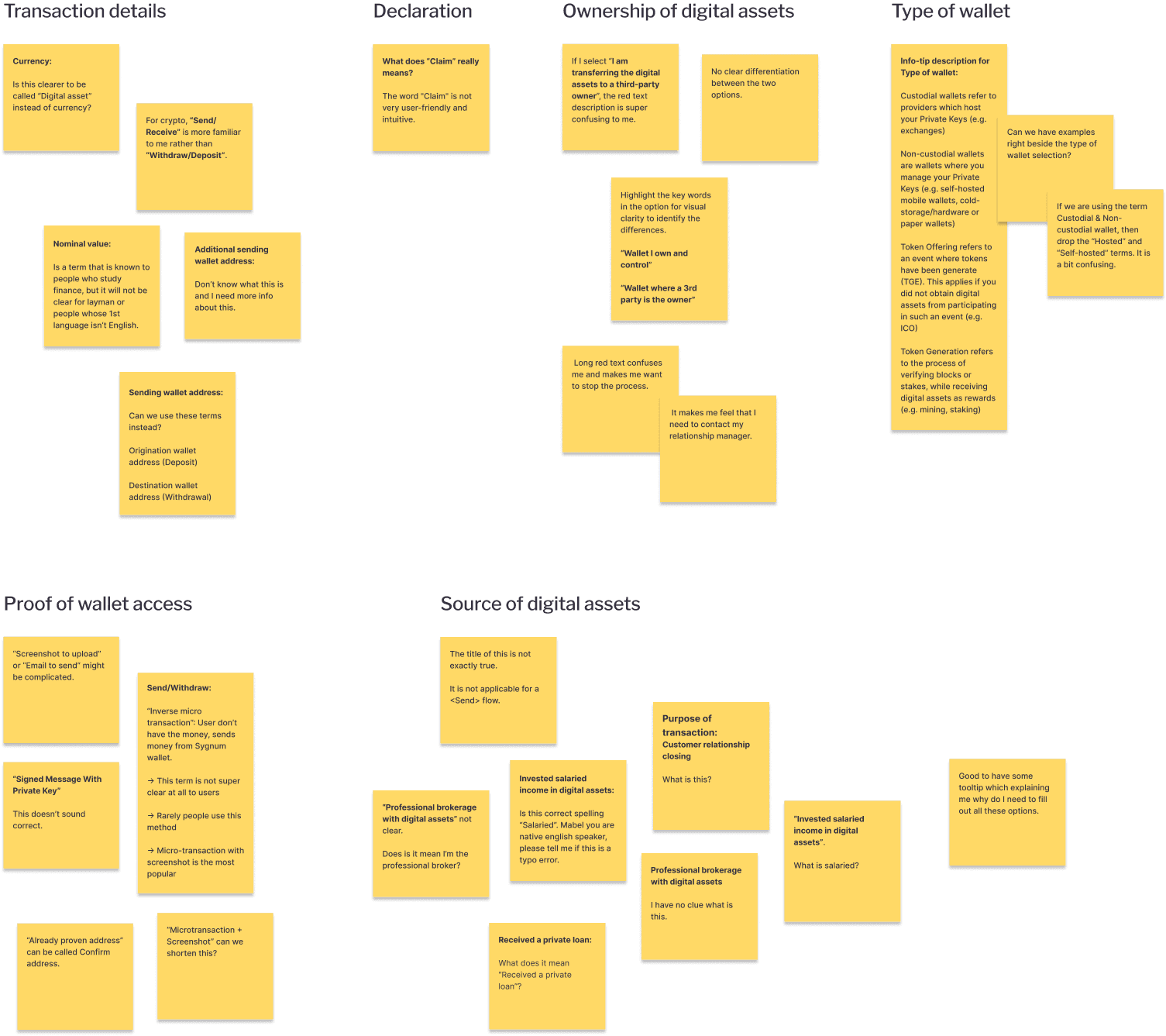
Content audit
Another challenge was organising key information and simplifying technical terms.
To better understand what users really needed, I looked closely at how the content was structured, especially for non-native English speakers.
Using Miller's law, I broke the content into smaller, easier-to-digest clusters, making it more user-friendly.
After revising the microcopy and tweaking parts of the questionnaire, we streamlined the form from 9 sections to just 4, adding a clear step-by-step guide for better usability.
User flow
Mapping the movement helps me visualise user options on each page, ensuring tasks are completed efficiently. It also keeps stakeholders and the team aligned on the flow.

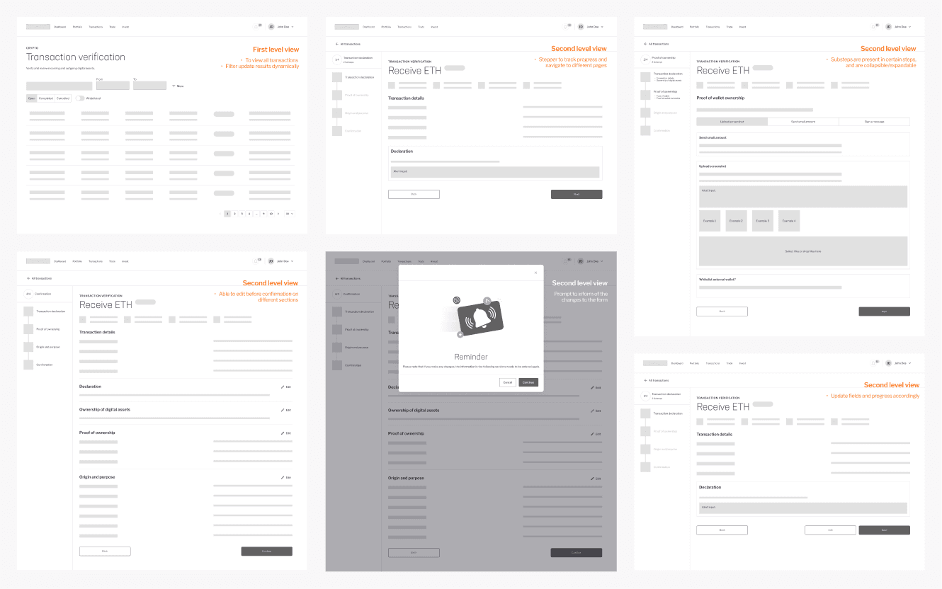
Before redesign
The older version of the transaction verification site had a challenging content hierarchy and layout that made it difficult for users to read.
Additionally, the site lacked responsiveness, and some user interface components caused confusion, creating friction in the user experience.
Design, Prototyping & Usability testing


After finalising the wireframes, the focus shifted to visual design. Usability testing was conducted once the transaction prototypes were created, leading to iterative improvements based on user feedback.
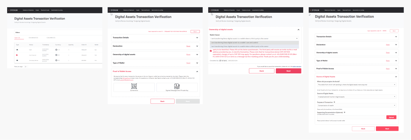
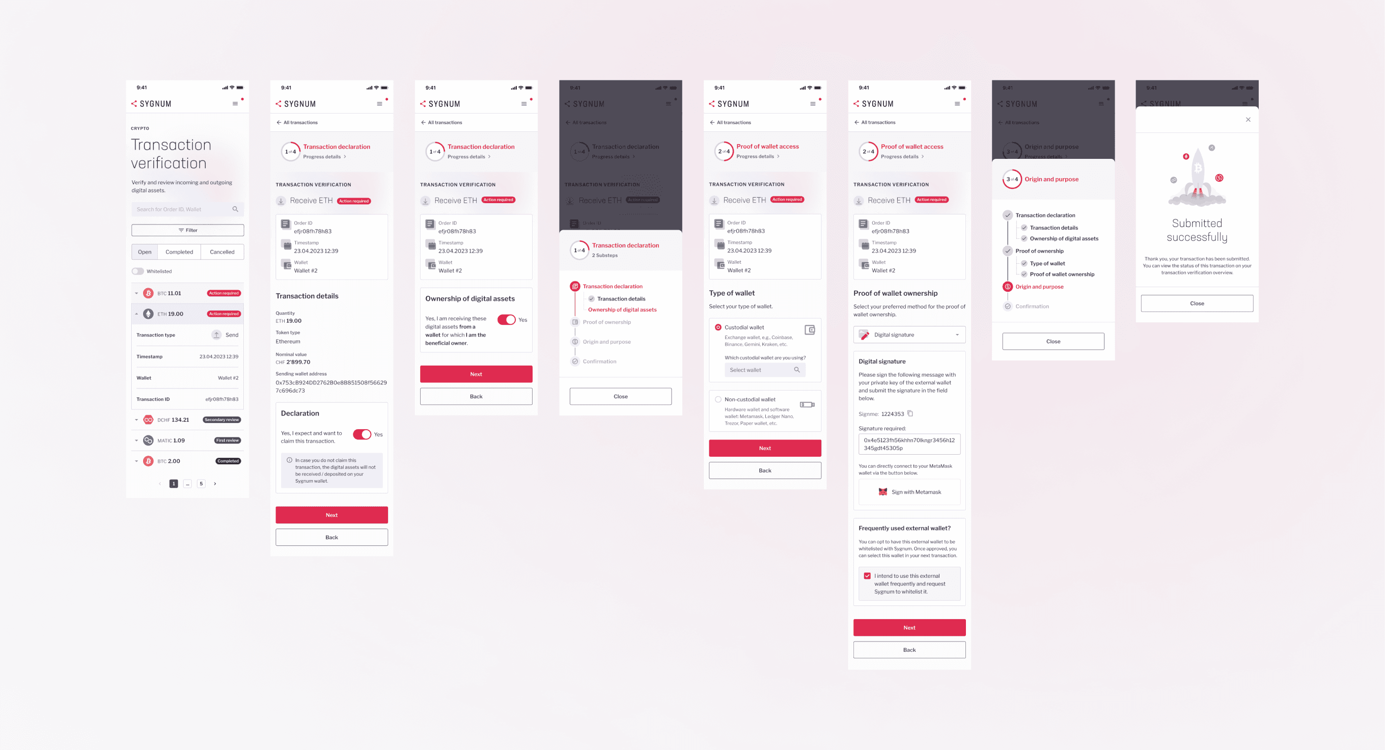
Solution
Design principles

Final solution
The final output is streamlined to guide users smoothly through the process with clear steps and helpful prompts.
Overall, user feedback has been positive, with many finding it easier to complete tasks with the new layout.
Introduced a stepper to guide users in their progress and tasks breakdown
Accessible and understandable copy to reduce user error rates and confusion
Restructuring the layout and content hierarchy to for users to navigate with ease, thereby optimising efficiency
Click here to view prototype.
Key takeaways
Designing the AML service experience demands clarity. Understandable copy can make or break the UX flow, yet it's often the hardest change to get buy-in for.
Securing management’s approval for copy changes is a crucial first step toward improving the user experience.
Saving an average of 1 minute per task can add up significantly over time. (e.g., Especially when a relationship manager has to complete the C-AML flow for multiple clients, saving just one minute per task adds up significantly over time)
Some areas to look into:
Integrated crypto deposit & withdrawal:
Take a step further to provide users the ability to have an integrated experience when making a crypto deposit or withdrawal.
Streamline wallet verification:
Provide recommendations for verifying wallet ownership based on previous selections to reduce users' cognitive load in decision-making.
Continuous feedback loop:
Introduce an in-app feedback feature for users to report issues or suggest improvements.