Brokerage & custody experience
Singapore Client Portal
COMPANY
Sygnum
ROLE
User Research, UX Design, Design System
Industry
Fintech
YEAR
2022

Context
Sygnum Singapore is a financial institution offering solutions for managing both digital and traditional assets. The Sygnum Singapore portal is designed to empower clients to easily self-serve and efficiently manage their digital assets.
Challenge
I was tasked with creating Sygnum's first-ever Singapore client portal, focusing on building a user-friendly platform that balanced security, transparency, and ease of use while meeting regulatory requirements.
Goal
To provide clients with a secure, user-friendly platform to manage their digital assets confidently, combining brokerage and custody services in compliance with local regulations.
Timeframe
3 months
Target audience
Accredited investors
Background
To guide this design, I focused on three key questions:
1. How can I create an intuitive experience that meets the needs of all client types?
2. What are the primary needs and pain points in managing digital assets?
3. How can the design be scalable in the future?
Process

I began by researching the digital assets and banking industries to understand the similarities and differences between digital and traditional assets.
This groundwork deepened my knowledge of the crypto space. I then focused on client needs, defined requirements, developed MVP ideas, and tested them.
This structured approach ensured effective project management and addressed key tasks at every stage.
Research & Planning
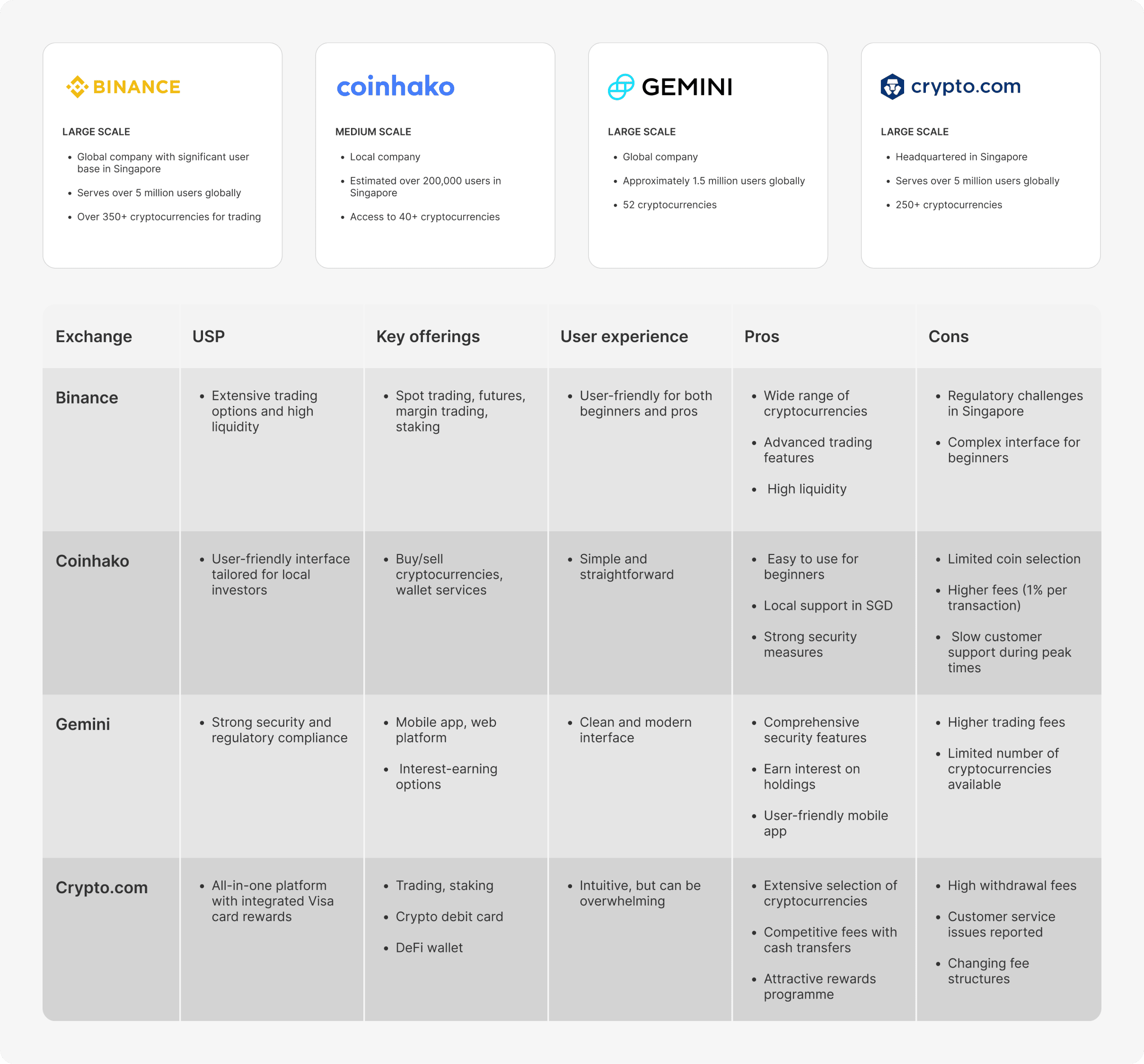
Analysed 4 crypto exchange platforms to understand features, trends, and user flows, gaining insights to shape a user-focused client portal and align with industry standards.
User Interviews & Personas

I researched Web3 design by exploring exchanges, experiencing user flows, and interacting with interfaces like wallet connections and transactions. Key patterns included prioritising user control, transparency, and seamless interaction.
Insights from experienced colleagues further enriched my findings.

After researching key crypto players, I interviewed target users to understand their experiences and asset management practices. Using these insights, I created personas to align the team with user behaviours and expectations.
Insight
The biggest challenge in managing digital assets is the uncertainty users face after initiating a transaction. They primarily seek timely status updates and alerts to guide them through the process and inform them of the next steps.
At the core, users want to feel secure and confident when handling their money.
Affinity Mapping
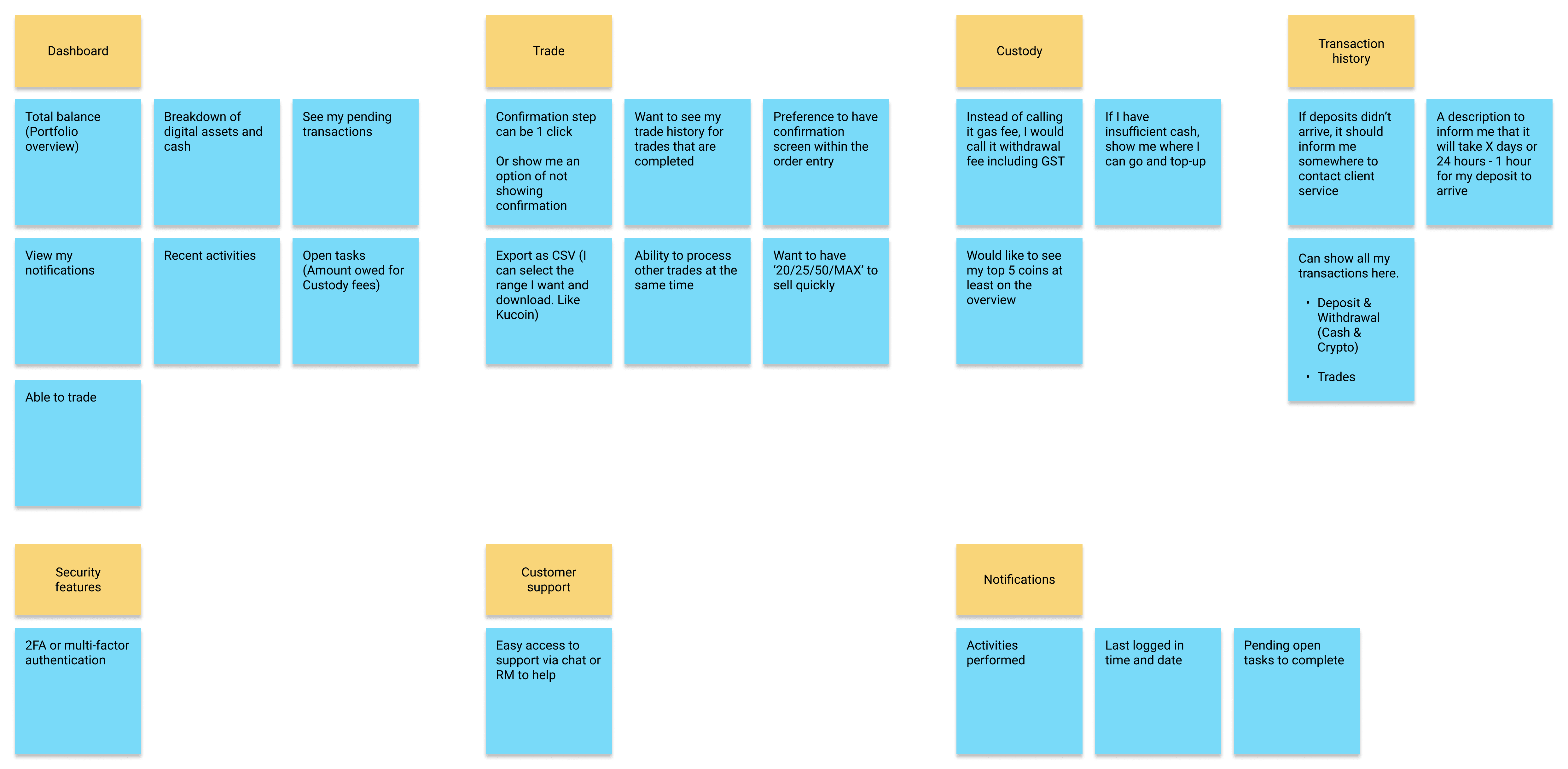
Organised key findings through an affinity mapping process for this initial stage, identifying and grouping feedback from users for the core features.
Design & Prototype
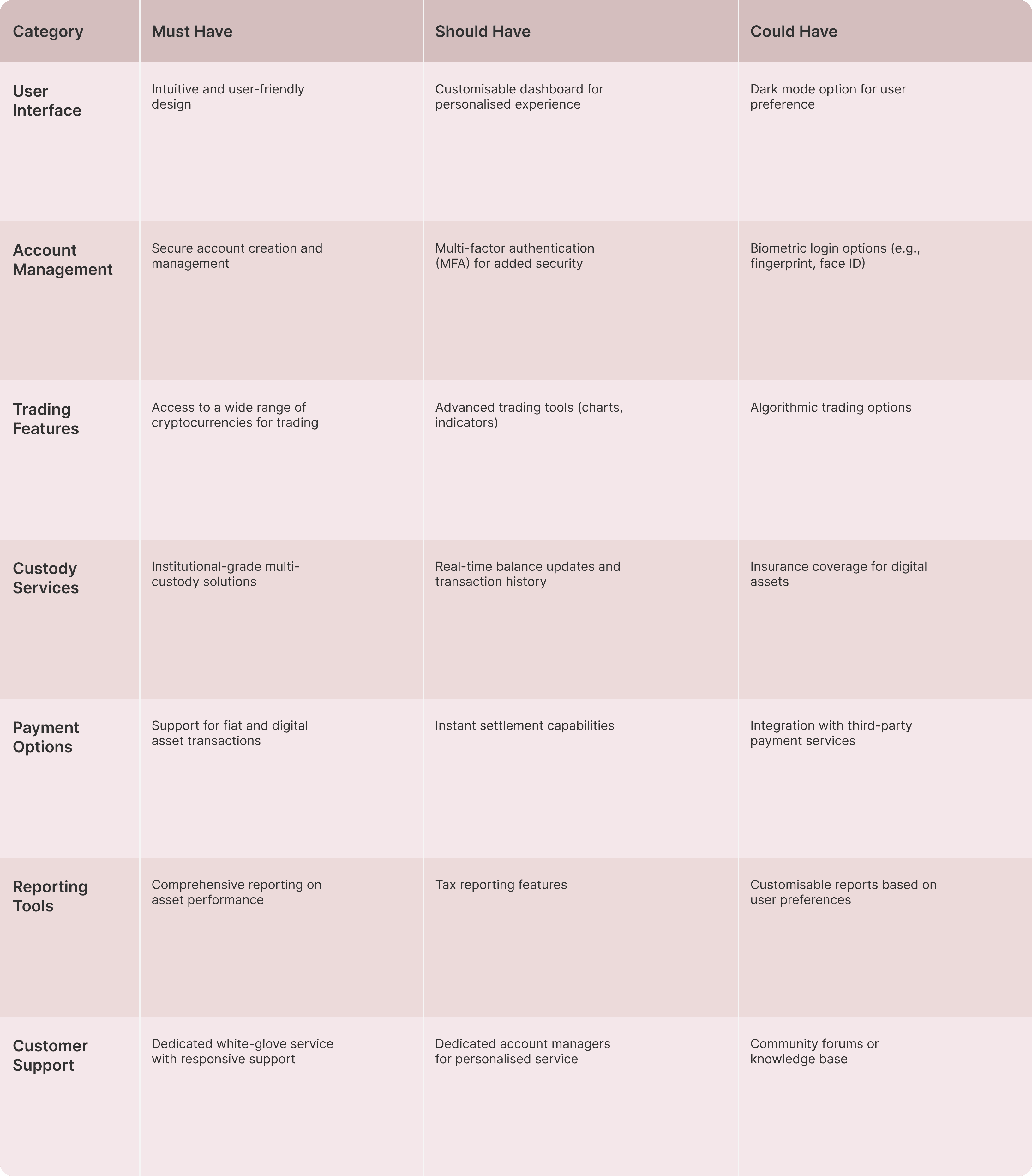
I prioritised core features into Must-have, Should-have, and Could-have, aligning with business goals and future plans. This helped me focus on delivering the most critical items for the MVP efficiently.
User flow & Whiteboarding

I started with a whiteboard session to map the portal's structure, features, and user flow, sparking team discussions on ideal paths, error flows, and edge cases.
Next steps was testing the prototype with users to gather insights and refine the design for better usability and functionality.
Solution
Design Principles
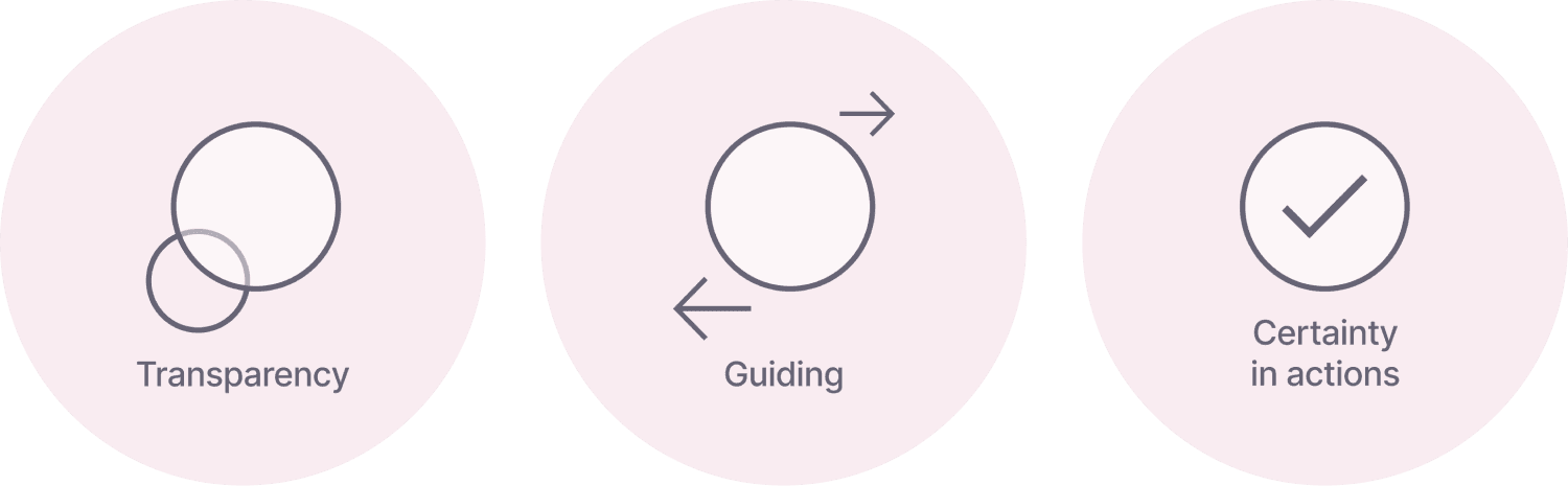
Transparency
As a service that deals with money, it is crucial to clearly communicate transparency through the right content and design.
Guiding
Displaying visuals with key information at the right moment ensure users are guided through each step with clarity and confidence.
Certainty in Actions
To ensure users feel confident in taking an action, the designs must clearly communicate to the users their expectations each time before they make a decision.
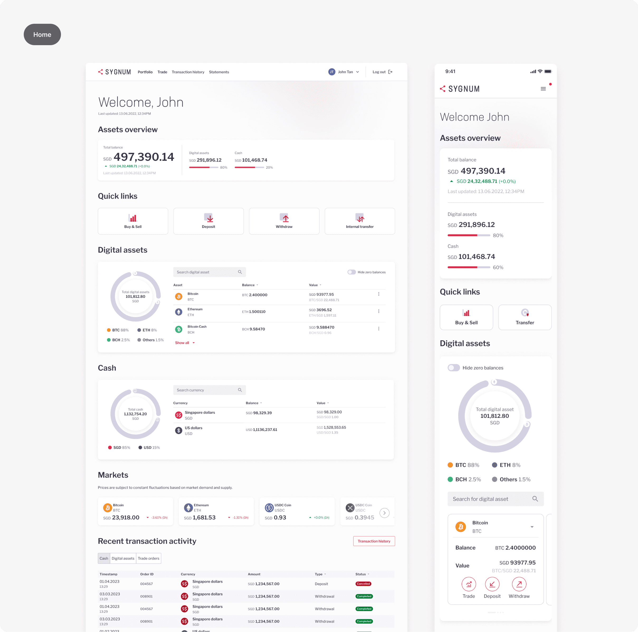
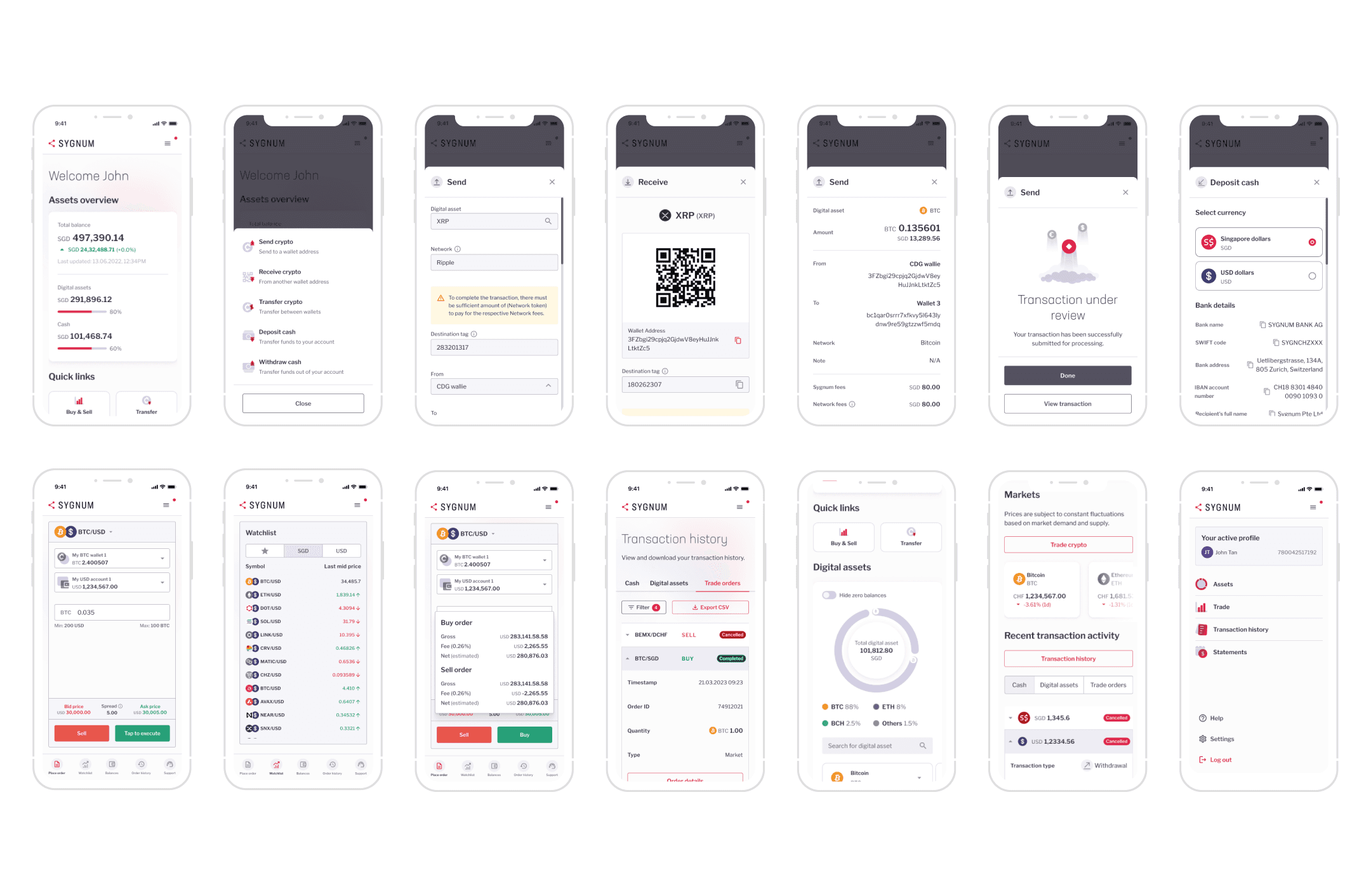
Responsive assets overview dashboard to manage digital assets and cash holdings.
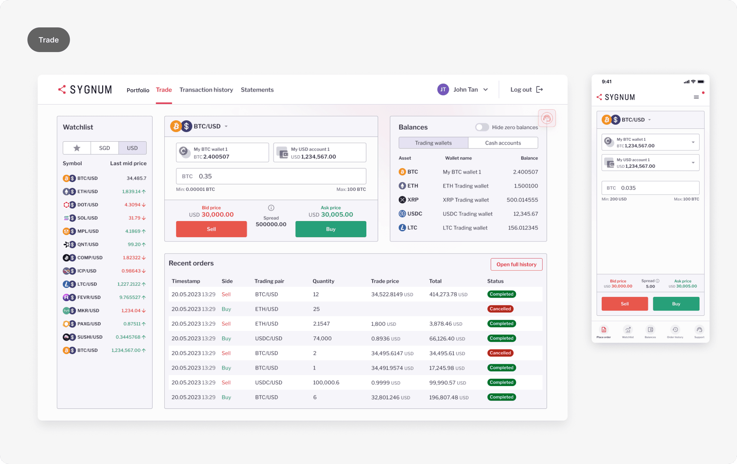
Users are able to star their favourite trading pair from the watchlist.

Send crypto with detailed breakdown of fees and more info.

Scan QR code or copy wallet address to receive crypto.

Easily add a bank account and secure cash withdrawals.
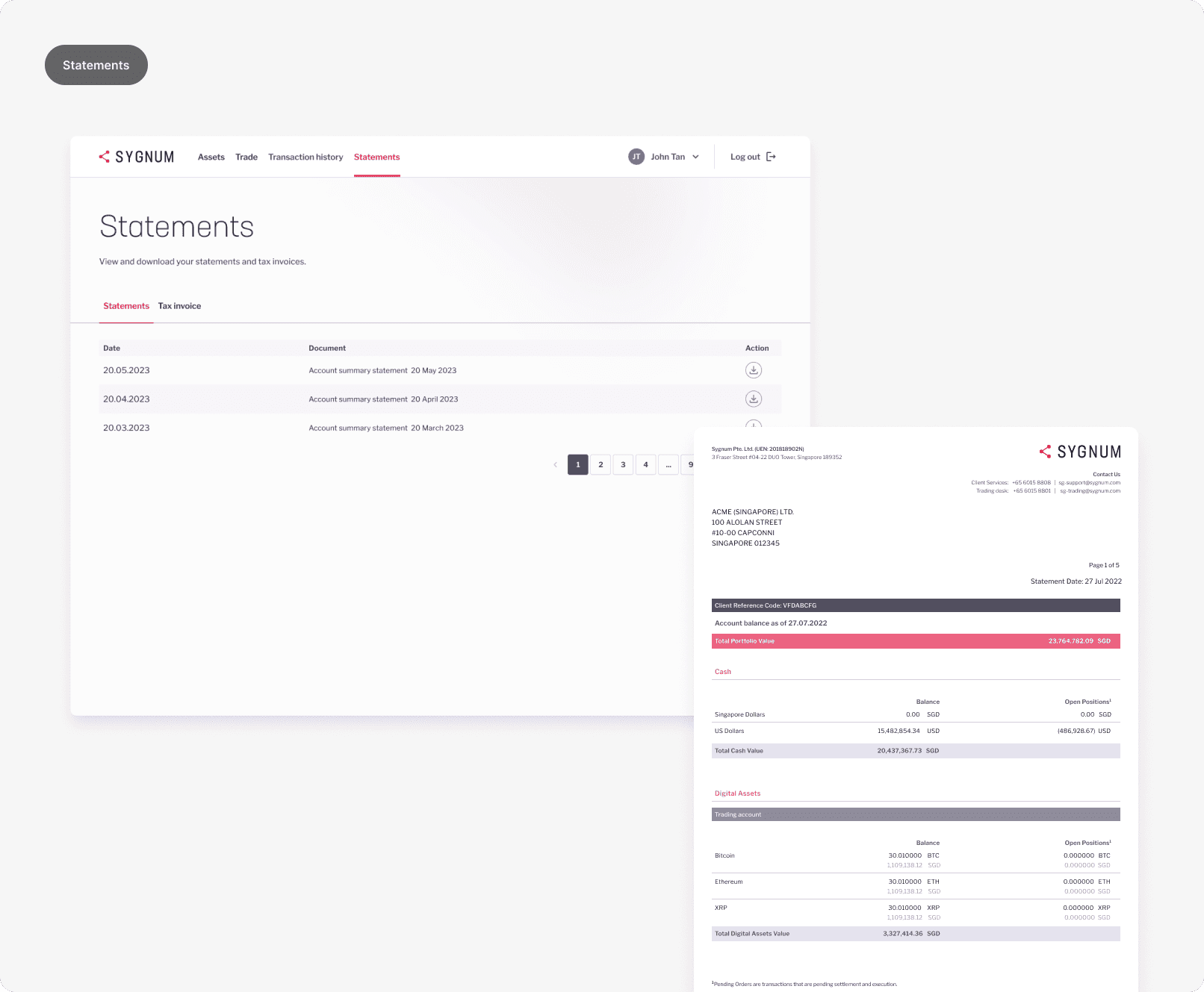
View and download statements and tax invoices.

View and track all transactions in a single tab.

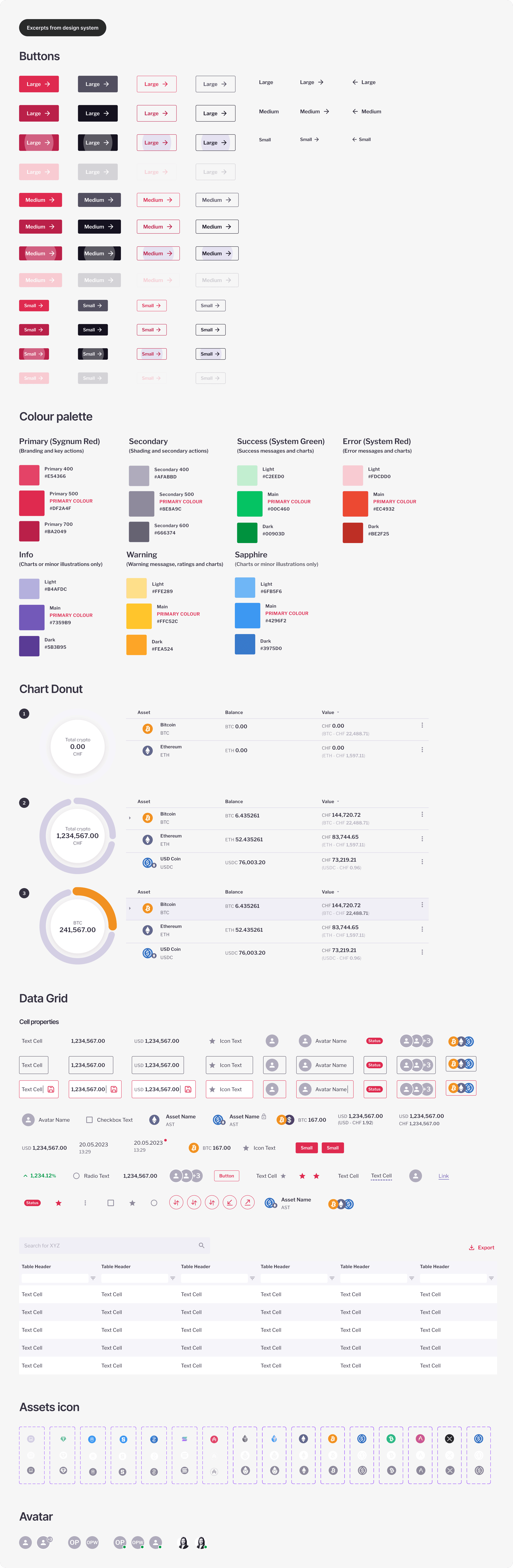
Components for design.
Testing
Features tested: Trade, Download statements
The objectives for validating the client portal through usability testing were to determine if users:
1. Can easily locate where to execute specific tasks [Trade & Download statements: Go-live]
2. Understand the content and know the next steps
3. Successfully navigate to relevant pages to find out the information they need
Feedback
Despite a relatively low active user engagement of 41–52% (12–15 out of 29 clients) during the initial launch phase, the overall feedback on the design interface and user experience was positive.


Learnings
The platform was designed to cater to a niche audience in the high-net-worth and institutional investor segment. However, user engagement was impacted by external business factors, such as licensing delays and the platform's early-stage audience size.
User Engagement is a shared responsibility
The active user engagement rate reflects broader business challenges, such as licensing delays, rather than design flaws.
By working more closely across teams, we could have better anticipated challenges, set clearer expectations, and ensured the platform’s readiness to support user engagement from the start.
Design effort
Despite business challenges, the platform’s design was validated through user testing with positive feedback on ease of navigation for this MVP. There is definitely room for improvement for different product features down the road.
A balanced perspective
This experience reminded me that good design alone isn’t enough—it needs the right business strategy to thrive.